TechSurvey: Improving the Annual Survey Experience for Software Engineers
Client: AWS-Amazon Software Builder Experience | Engagement: 2022-2026 | Tools: Figma
Mixed-Method Research | Data Visualization | Org-wide impact

TechSurvey is the annual voluntary survey for software engineers and people in Tech roles across AWS and Amazon. It collects feedback to improve the employee experience, give managers signal on their teams, and benchmark performance across the org. I ran the research that reshaped the survey program and designed the analytics report that managers use to act on their results, work that touches every org in AWS.
Design Impact
Two connected threads
1: Research that changed the program
The survey took over an hour to complete and participation was difficult to secure. I ran a qualitative study with 18 managers across the globe to understand why and what would make the data more useful. The findings directly shaped a multi-year improvement plan that is still being referenced to this day.
What the research surfaced
Survey length
The survey took over an hour to complete and participation was difficult to secure. I ran a qualitative study with 18 managers across the globe to understand what would make an impact on the experience for managers. The findings directly shaped a multi-year improvement plan that is still being referenced.
Data access
Only managers with 10 or more respondents received a summary report, leaving many to analyze the raw dataset themselves. However, this was a daunting task and most managers didn't, and they missed out on valuable insights.
What managers need
Managers used the data to set team goals, make process adjustments, and advocate for headcount. They wanted year-over-year comparisons and said knowing where things were going poorly was more important than seeing where things were going well.
2: Design that made the data actionable
Research revealed that most managers who didn’t receive a summary report weren't analyzing the raw data themselves and missing out on key opportunities for improvements. Managers said the data was valuable and they wanted it, but if it was going to drive action, it needed to be offered in a easy to parse format. I redesigned the analytics report from a technical document into a visual, web-based experience built to showcase their data in a digestible way.
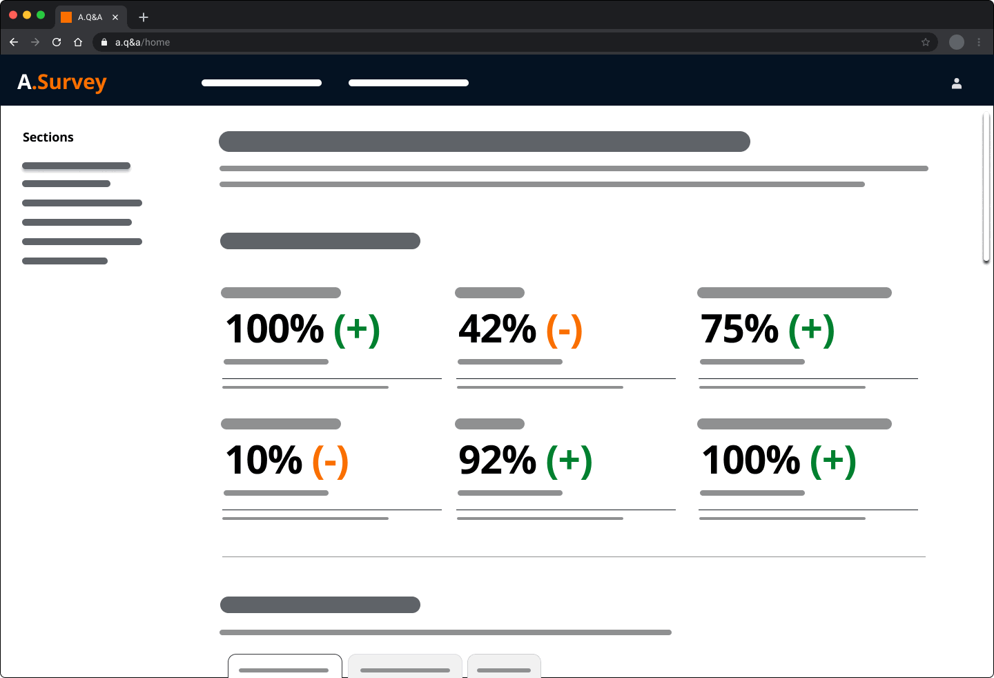
Report design: From technical document to digestible data
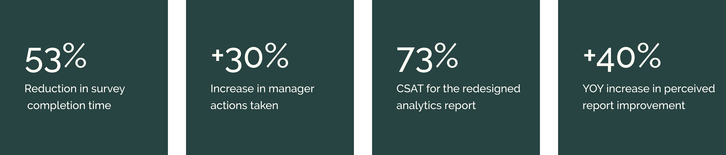
I redesigned the analytics report from a narrative document into a visual, web-based report with simplified data visualizations, accessible color, and an easy to layout. Research on the new report design revealed managers appreciated the design changes and used screenshots of the data visualizations (along with the data) to advocate to their leaders for team improvements.
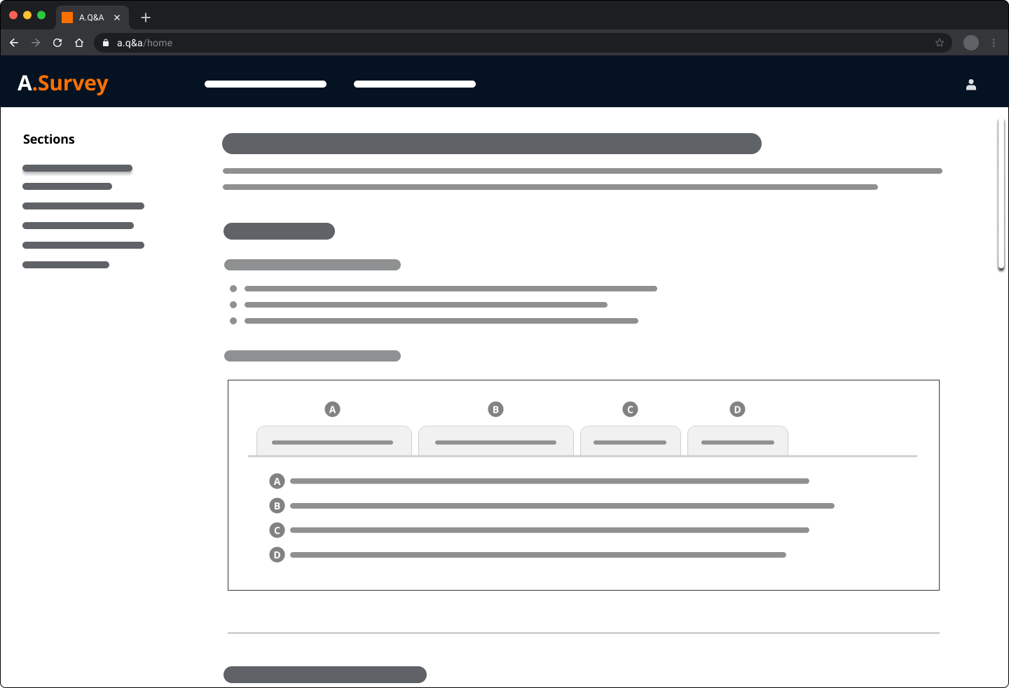
Tech Survey: First iteration
Design Evolution
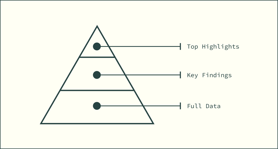
After managers had received the new analytic report with their actual data, I conducted research to identify areas for improvement. The research revealed that despite favorable sentiment toward the design, they were skipping the introduction, missing the tabs containing deeper information, and misunderstanding the benchmark. Additionally, managers said they couldn't connect the key findings sections back to the high-level overview at the beginning of the report. Each section of the report was designed around the same three-tier structure, moving from top highlights down to key findings and then full data, but the relationship between the sections and the high-level overview was said to be unclear and causing confusion when interpreting the data.
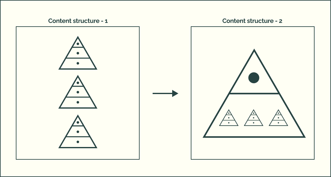
I advocated for making this connection explicit in the second version, ensuring the sections were structurally tied to the high-level overview so managers could see how the detail related to the top-level picture. The redesign also significantly reduced text for clarity, moved key navigation near the top of each visualization for ease of exploration, changed the design to ensure benchmark information was next to every data visualization for clarity, and replaced bespoke data visualizations with graphs for continuity and more intuitive interpretation.
What changed as a result
Program changes: Research that moved the needle
The findings led to hiring a PhD Scientist to revamp the survey, reducing completion time by 50%. The respondent threshold for receiving a summary report was lowered from 10 to 4 participants, putting data in front of significantly more managers. Action steps taken by managers increased by 30%.
Tech Survey: second iteration
Managers consistently said pinpointing the areas for improvement from the data were most important to them and that the report should help them look around corners. In response, I identified that the team already had year-over-year (YOY) data that wasn't being surfaced and proposed a new section to pull out the top three biggest YOY changes, both positive and negative, so managers could see where things were heading before they became larger issues.
Lasting impact
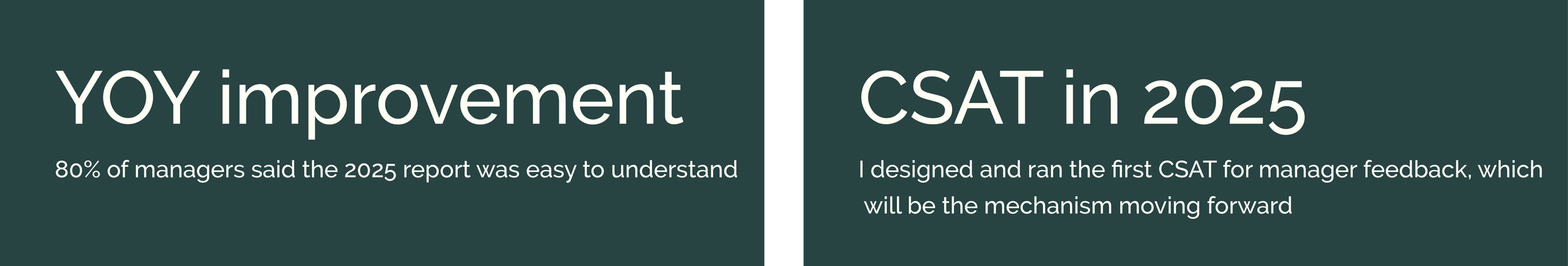
A follow-up study conducted by the Tech Survey team found that 80% of managers said the new analytics report (from 2025) was easy to understand.
The findings from the initial research are still influencing the program to this day.
After three rounds of qualitative research for the report, overall feedback had become consistent year over year. I proposed shifting to a CSAT to give the team a repeatable measurement mechanism as well as collecting pointed feedback at a larger scale. The team agreed and I designed and ran the 2025 survey.